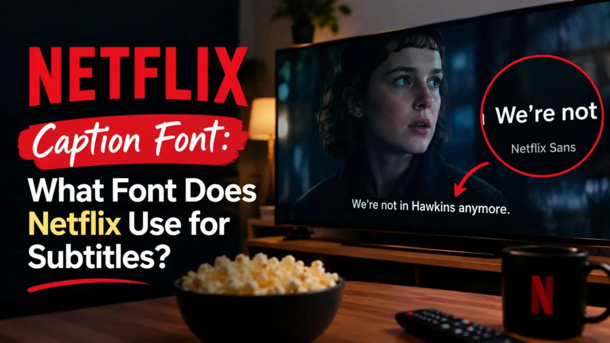
For English subtitles, Netflix lists Netflix Sans as its subtitle font. However, the exact font can vary by language because Netflix supports different writing systems and uses other typefaces where needed. That means there is not always one universal font across every subtitle language.
This guide explains what font Netflix uses for captions and subtitles, why it works well on screens, and how you can change your subtitle appearance. You will also learn about Netflix Sans, similar fonts, subtitle customization, caption readability, and common questions about the Netflix typography style.
What Is the Netflix Caption Font?
Netflix uses different subtitle fonts depending on the language and writing system. For English and several other supported languages, Netflix identifies Netflix Sans as the subtitle font.
Netflix Sans was created as a custom typeface for Netflix. It is designed to work across interfaces, marketing materials, and other Netflix experiences. The typeface was developed with Dalton Maag and was built with a strong focus on functionality and global language support.
The important point is that “Netflix font” and “Netflix caption font” are not always exactly the same thing. Netflix uses different typefaces for certain languages and scripts.
What Font Does Netflix Use for English Captions?
For English subtitles, Netflix lists Netflix Sans as the subtitle font.
Netflix’s partner documentation specifically lists Netflix Sans for English subtitles in several regions, including Global English, UK English, Australian English, and Indian English.
This makes Netflix Sans the most relevant answer when someone searches for the Netflix caption font used for English.
It also explains why screenshots of Netflix subtitles can look different from fonts such as Arial, Helvetica, or other common sans-serif fonts.
Why Netflix Sans Works for Captions
A subtitle font has a difficult job. It must remain readable while viewers are watching moving images, changing backgrounds, and different lighting conditions.
Netflix Sans was designed as a flexible typeface for Netflix’s broad range of uses. Its clean appearance helps text remain visually simple without becoming distracting.
Is Netflix Sans the Same as the Netflix Logo Font?
Not exactly in the way many people assume.
Netflix has a recognizable wordmark and a broader typography system. Netflix Sans is a custom typeface used across many Netflix brand and product applications, while the Netflix wordmark itself has specific brand construction and usage rules.
Therefore, copying the appearance of the Netflix logo is different from reproducing the look of Netflix subtitles.
If your goal is to recreate the subtitle appearance, focus on subtitle typography rather than trying to copy the red Netflix wordmark.
Why Does the Netflix Caption Font Look So Clean?
Netflix subtitles need to remain readable without becoming the main visual element on the screen.
Several typography choices help create this effect.
Simple Letterforms
Clean sans-serif letterforms are generally easy to recognize quickly. That matters when viewers only have a short time to read a subtitle before the next line appears.
Strong Contrast
Subtitles often appear over complicated backgrounds. A readable subtitle style needs enough contrast to separate the text from the scene.
Comfortable Spacing
Spacing affects how quickly people can recognize words. A subtitle that feels too cramped can become tiring to read.
Consistent Appearance
A consistent typography system makes subtitles feel familiar across different shows and movies.
Can You Change the Netflix Caption Font?
Yes. Netflix provides subtitle appearance controls in supported locations and on supported devices.
According to Netflix’s Help Center, users can change options such as the subtitle font, size, shadow, and background color. The exact controls can vary by device, language, and region.
This is especially useful if the default subtitle appearance is too small, too bright, or difficult to read.
What You Can Customize
Depending on your device and language, Netflix may provide controls for:
• Font style and appearance options for subtitles 🅰️ • Subtitle size for easier reading 🔎 • Text shadow to improve separation from the background 🌑 • Background color for stronger visual contrast 🎨 • Other subtitle appearance settings supported by your device ⚙️
How to Change the Netflix Caption Font on a Browser
Changing subtitle appearance is straightforward when the feature is available for your profile.
Netflix provides the following general path through its account settings.
• Open Netflix in a web browser and sign in 🔐 • Open your Account page ⚙️ • Go to Profiles and choose your profile 👤 • Select Subtitle Appearance 💬 • Choose your preferred subtitle style 🅰️ • Select Save to apply the changes 💾 • Start Netflix again and check your subtitle appearance ▶️
The available choices can differ by country, language, and device. Netflix also notes that some older devices may not display every selected appearance option.
How to Change Subtitle Style on a TV
TV controls can work differently from browser settings.
Start a movie or show, pause playback, and open the player controls. On supported TVs or streaming devices, Netflix provides subtitle settings that can allow you to adjust size and style.
If the settings option does not appear, your device or subtitle language may not support those appearance controls.
After changing settings, you may need to reload the Netflix app on some connected TV devices.
How to Change Netflix Subtitle Appearance on Android
Android users can adjust subtitle appearance through the Netflix app when the feature is supported.
The general process is:
• Open the Netflix app on your Android phone or tablet 📱 • Tap My Netflix in the lower-right corner 👤 • Tap your profile name near the top 🔽 • Select Manage Profiles ⚙️ • Choose the profile you want to edit 👤 • Select Subtitle Appearance 💬 • Adjust the available appearance settings 🎨 • Save or allow the settings to update automatically ✅
Netflix notes that Android subtitle appearance changes made through the app apply to titles watched on that Android mobile device.
Does Every Language Use Netflix Sans?
No.
This is an important detail when discussing the Netflix caption font.
Netflix supports many writing systems, and one typeface cannot necessarily provide the same typography for every script. Netflix’s documentation lists different subtitle fonts for various languages.
For example, its partner documentation identifies different fonts for languages and scripts such as Arabic, Chinese, Hebrew, Hindi, Japanese, Korean, and Thai.
Therefore, saying “Netflix always uses Netflix Sans for every caption” would be inaccurate.
Which Font Does Netflix Use for Different Languages?
Netflix’s subtitle font can change according to the language.
Some examples from Netflix’s documentation include:
• English uses Netflix Sans for supported English variants 🇺🇸 • French uses Netflix Sans for supported French variants 🇫🇷 • German uses Netflix Sans 🇩🇪 • Spanish uses Netflix Sans for listed Spanish variants 🇪🇸 • Japanese uses HeiseiMaruGoth213_CForNetflix 🇯🇵 • Korean uses YDGothic120ProForNetflix 🇰🇷 • Hindi uses HandsetSansDevanagari 🇮🇳 • Arabic uses HandsetNaskhArabic-Regular 🕌 • Thai uses a different typeface, Graphik TH 🇹🇭 • Chinese subtitles use Netflix-specific font configurations for the relevant script 🇨🇳
This language-specific approach helps Netflix maintain readable subtitles across different writing systems.
Is Netflix Sans a Free Font?
Netflix Sans is a custom typeface created for Netflix, so it should not be treated like a normal free font that anyone can simply download and use.
Netflix’s brand assets and typeface arrangements are proprietary. If you want a similar design for a personal project, it is safer to choose a legally licensed alternative rather than downloading an unofficial copy of Netflix Sans.
Always check the license before using any font for commercial work.
What Fonts Look Similar to Netflix Caption Font?
If you want to create a Netflix-inspired visual style, several clean sans-serif fonts can provide a similar general feeling.
The goal should not be an exact copy. Instead, choose a font with clear letterforms, balanced spacing, and strong screen readability.
Clean Sans-Serif Alternatives
• Arial for a familiar and straightforward subtitle appearance 🅰️ • Helvetica for a clean and neutral design 🖥️ • Inter for modern digital interfaces 💻 • Montserrat for a more geometric appearance 🔷 • Avenir for a polished and balanced look ✨ • Proxima Nova for a modern interface style 🎬 • Gotham for a geometric, contemporary appearance 🔠
These alternatives are not the Netflix caption font itself. They are simply options you can consider when designing your own content.
How to Make Netflix-Style Captions More Readable
Good captions are not only about choosing a font. Size, contrast, spacing, and placement also matter.
Try these practical principles:
• Choose a simple sans-serif font for quick reading 👀 • Use enough contrast against the video background ⚪ • Avoid extremely thin font weights on busy scenes 🎥 • Keep the text large enough for the viewing distance 🔎 • Avoid excessive letter spacing that slows reading ↔️ • Use a subtle shadow when the background changes frequently 🌑 • Keep subtitle lines reasonably short 📖 • Avoid decorative fonts for dialogue captions 🚫 • Test captions on both bright and dark scenes 🌗 • Check the result on the actual screen viewers will use 📺
Netflix Caption Font vs. Regular Subtitle Fonts
The biggest difference is not necessarily that Netflix Sans is dramatically different from every other sans-serif typeface.
Instead, Netflix uses a controlled typography system designed for its own products and content environment.
A regular subtitle font might work perfectly well. However, professional streaming subtitles also depend on timing, placement, contrast, line breaks, language support, and accessibility considerations.
So, choosing the right font is only one part of creating good captions.
Why Subtitle Readability Matters
Captions should support the story rather than compete with it.
Viewers may use subtitles because they are watching in a noisy environment, learning a language, following dialogue quietly, or relying on captions for accessibility.
Netflix treats subtitles and closed captions as accessibility features and provides customization options for supported users and devices.
That makes readability more than a design preference. For many viewers, clear captions are an important part of being able to follow the content.
Netflix Captions vs. Closed Captions
Subtitles and closed captions are related, but they can provide different information.
Subtitles generally focus on spoken dialogue. Closed captions can also include important audio information, such as sounds, music cues, or speaker identification.
Netflix introduced an additional original-language subtitle option in 2025 that shows only spoken dialogue, while English CC continues to include additional audio cues.
This distinction is useful when searching for a Netflix caption font because the visual style can apply to both subtitles and closed captions, even though the text itself may contain different information.
Can You Use the Netflix Caption Font in Canva?
You generally should not assume that Netflix Sans is available as a normal Canva font.
If your goal is to create social media graphics, video captions, thumbnails, or presentations with a similar visual style, choose a properly licensed alternative available in your design software.
Inter, Arial, Helvetica, Montserrat, or similar clean sans-serif fonts can create a modern caption appearance without pretending to be the official Netflix typeface.
Can You Use a Netflix-Style Font for YouTube Videos?
Yes, you can create captions with a similar visual approach for your own videos.
However, there is an important difference between using a similar typography style and copying Netflix’s protected branding.
For a clean streaming-style design, use a simple sans-serif font, strong contrast, readable sizing, and consistent placement.
You can create the overall feeling without reproducing Netflix logos, brand assets, or a confusingly similar branded presentation.
Is the Netflix Caption Font Good for Social Media Videos?
A Netflix-inspired caption style can work well for short-form videos because clean typography is easy to read on mobile screens.
However, social media captions often need stronger visual emphasis than streaming subtitles.
For example, creators may use larger text, highlighted words, animated captions, or different colors to keep viewers engaged.
If readability is your priority, keep the main text simple and avoid adding too many effects.
Common Mistakes When Copying Netflix Caption Style
Trying to recreate the Netflix look can become less effective when the design becomes too decorative.
Avoid these common mistakes:
• Using a fancy font that slows down reading 🎭 • Making captions too small for mobile viewers 📱 • Placing white text over bright backgrounds without contrast ⚪ • Adding too many colors to every caption 🌈 • Using excessive animations that distract from the speaker 🎬 • Copying Netflix branding instead of simply using clean typography 🚫 • Ignoring font licensing when creating commercial content ⚖️ • Assuming one font works equally well for every language 🌍
Best Practices for a Netflix-Inspired Caption Design
A strong caption design should feel effortless.
Start with a readable sans-serif typeface. Then adjust size, weight, spacing, contrast, and placement based on the video.
For most projects, consistency matters more than adding visual effects.
A useful workflow is:
• Pick one readable sans-serif family 🅰️ • Choose a comfortable weight ⚖️ • Set a size that works on phones and larger screens 📱 • Add enough contrast for changing backgrounds 🌓 • Keep line breaks natural 📖 • Preview captions during fast dialogue 🎬 • Test the design with different scenes 🔍 • Check the font license before publishing commercially 📄
Frequently Asked Questions About Netflix Caption Font
What is the Netflix caption font?
For English subtitles, Netflix lists Netflix Sans as its subtitle font. However, Netflix uses different fonts for some languages and writing systems.
Is Netflix Sans the font used for English subtitles?
Yes. Netflix’s partner documentation lists Netflix Sans for several English subtitle variants, including Global English, UK English, Australian English, and Indian English.
Can I download Netflix Sans?
Netflix Sans is a custom Netflix typeface rather than a typical public font. You should not rely on unofficial downloads. Use a properly licensed alternative for your own projects.
Can I change the Netflix subtitle font?
Netflix allows users to customize subtitle appearance in supported locations and on supported devices. Available options can include font, size, shadow, and background color.
Why does my Netflix subtitle font look different?
The appearance can vary because of your language, device, region, profile settings, and the subtitle features supported by that device.
Does Netflix use the same font for every language?
No. Netflix uses different typefaces for certain languages and writing systems. This helps support scripts that require different typographic designs.
What font is closest to the Netflix caption font?
There is no single official replacement. Clean sans-serif fonts such as Inter, Arial, Helvetica, Montserrat, Avenir, and Proxima Nova can provide a similar general visual feel.
Can I use Netflix Sans for my website?
You should not assume that Netflix Sans is available for general website use. For a commercial or public project, choose a font with licensing that clearly permits your intended use.
Is the Netflix logo font the same as the caption font?
The Netflix wordmark is a specific brand asset, while Netflix Sans is part of Netflix’s broader type system. The two should not be treated as interchangeable.
What font does Netflix use for subtitles in Japanese?
Netflix’s partner documentation lists HeiseiMaruGoth213_CForNetflix for Japanese subtitles. Different languages can use different typefaces.
Conclusion
The Netflix caption font is not simply one universal typeface for every language. For English subtitles, Netflix identifies Netflix Sans as the subtitle font, while other languages can use different typefaces designed for their writing systems.
If you want to change your Netflix subtitles, supported settings can let you adjust the font, size, shadow, and background appearance. The exact options depend on your device, language, and region.
For your own videos or designs, you do not need to copy Netflix’s branding to achieve a similar clean look. A readable sans-serif font, strong contrast, comfortable sizing, and consistent placement can produce an effective streaming-style caption design.
The key is simple: prioritize readability first, then choose typography that fits your content and audience.

I am Ethan Miles, a digital creator and caption enthusiast who loves turning simple moments into powerful words. I specialize in crafting creative, trendy, and engaging captions that help your posts stand out. At Captionestry, I focus on delivering fresh ideas, relatable expressions, and scroll-stopping content for every mood and moment. I’m passionate about social media culture, photography, and the art of storytelling through short, impactful lines.